P4
Edited Photos
Before:After:
Before:
After:
To improve this photo, I increased the whites and highlights as well as the red tones in order to create a stronger visual representation of the feeling and meaning behind the tattoo - a lighthearted memory of a beloved pet. To help further develop this, I added a light pink and blue tint to the photo. Due to bringing in a blue tint, I increased the blue tones within the photo in order to even the colour balance out. Furthermore, the increase in white tones and highlights creates a contrast with the background of the photo which further makes the foreground stand out and bring the attention to the tattoo.
Before:
To elevate this photo, I increased the red tones to strengthen the colour of the symbol as well as create a more prominent connection to it and the skin tones of the model. I also increased the saturation and luminance of the yellow tones within the symbol to further help it to stand out. Considering what the symbol represents - hope - I thought it was necessary to make sure that it was vibrant and stood out from the photo and that the light shining onto the symbol could be interpreted as a light shining on the good (the hope) within the world. Furthermore, I also brought out a blue tint within the light to incorporate the blue of Superman's suit. Lastly, I slightly cropped the photo so that less of the background could be seen and the tattoo took up more of the photo to further enstate it as the focus.
Before:
After:
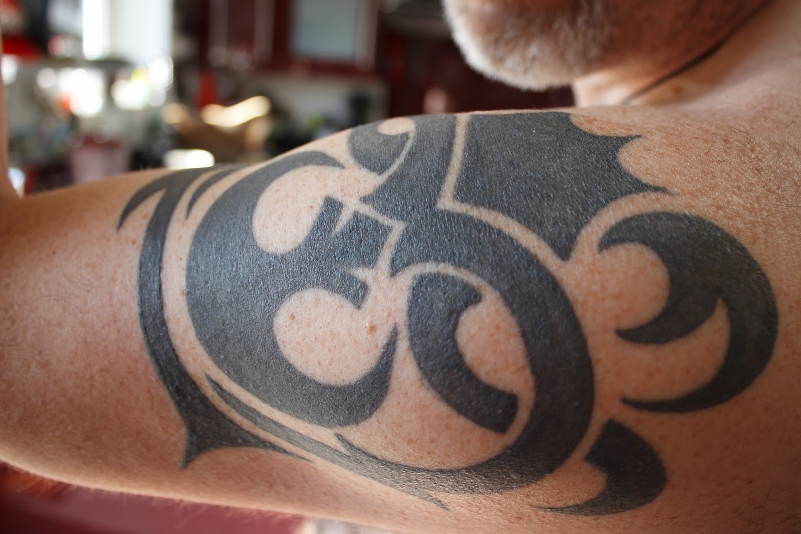
To enhance this photo, I first increased the red tones within in, especially within the background, in order to represent the connotation of the colour red with the Darth Maul symbols within the tattoo. I also made a similar representation stronger but for the Rebellion symbol by creating a blue tint to the light shining on it - blue representing the colour of Luke Skywalker's original lightsaber.
Before:
After:

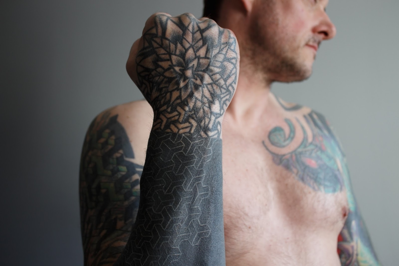
To further develop the photo, I made the saturation of all of the different colours of the tattoo much stronger in order to make them stand out more. To help this, I also altered the tones of the colours to make them slightly darker as well as increased the vibrancy of the photo. I also increased the shadows, blacks, and contrast of the photo to make the model and tattoos further stand out from the background and bring attention to them. Lastly, I increased the red within the skin tone so that it fits more with the saturation of the tattoo.


Comments
Post a Comment